
Color Phenomena and Their Relations to Goethe's Color Wheel (Part I)
Henrike Holdrege
From In Context #56 (Fall 2026) | View Article as PDF
During our Foundation Course at The Nature Institute, we spend one week studying light and color. We observe various natural phenomena, do experiments, watch demonstrations, paint with water colors, and study Goethe’s essay “The Experiment as Mediator of Object and Subject.” We also spend a good deal of time exploring how the phenomena relate to each other and what these relations reveal. In Goethe’s words, we “apprehend, collect, order, and develop.”
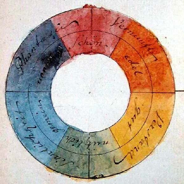
At the end of the week, we find in Goethe’s color wheel — by his own hand — a kind of summary or symbol for some of the insights we gained, insights that Goethe explores in his Theory of Color. While a more widely-known color wheel consists of three colors — yellow, red, and blue — Goethe’s color wheel consists of six colors: in clockwise order, red (vermillion, cinnabar), yellow, green, cyan (light blue, turquoise), violet, and magenta (peach-blossom, pink). Magenta is placed at the top and opposite to green. Here I will describe only two groups of color phenomena in relation to the color wheel. In a later article I will turn to the others. Together these phenomena will show Goethe’s color wheel in its full significance for our understanding of subjective and objective color appearances.
Colors that Arise Through the Interplay of Light and Turbid Media
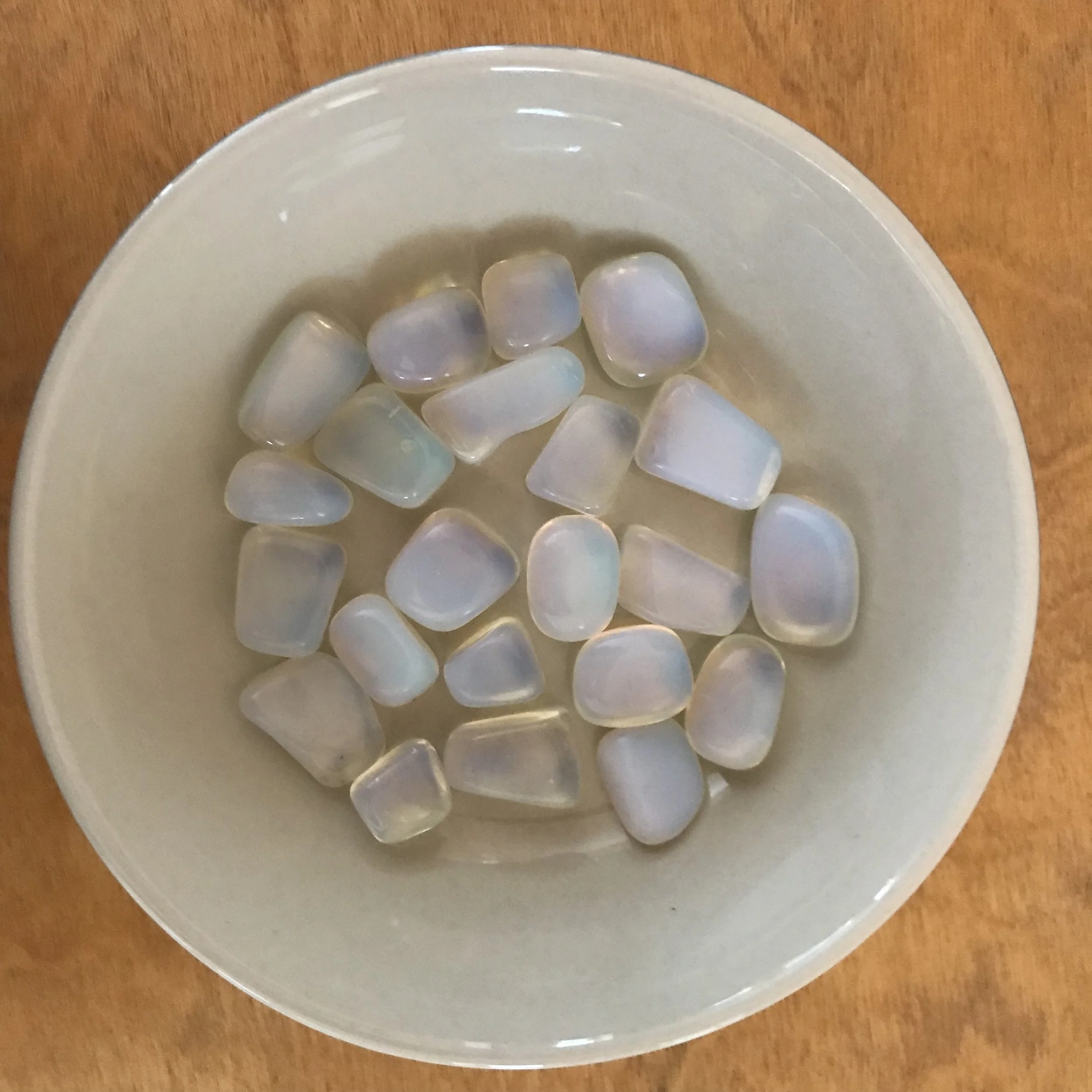
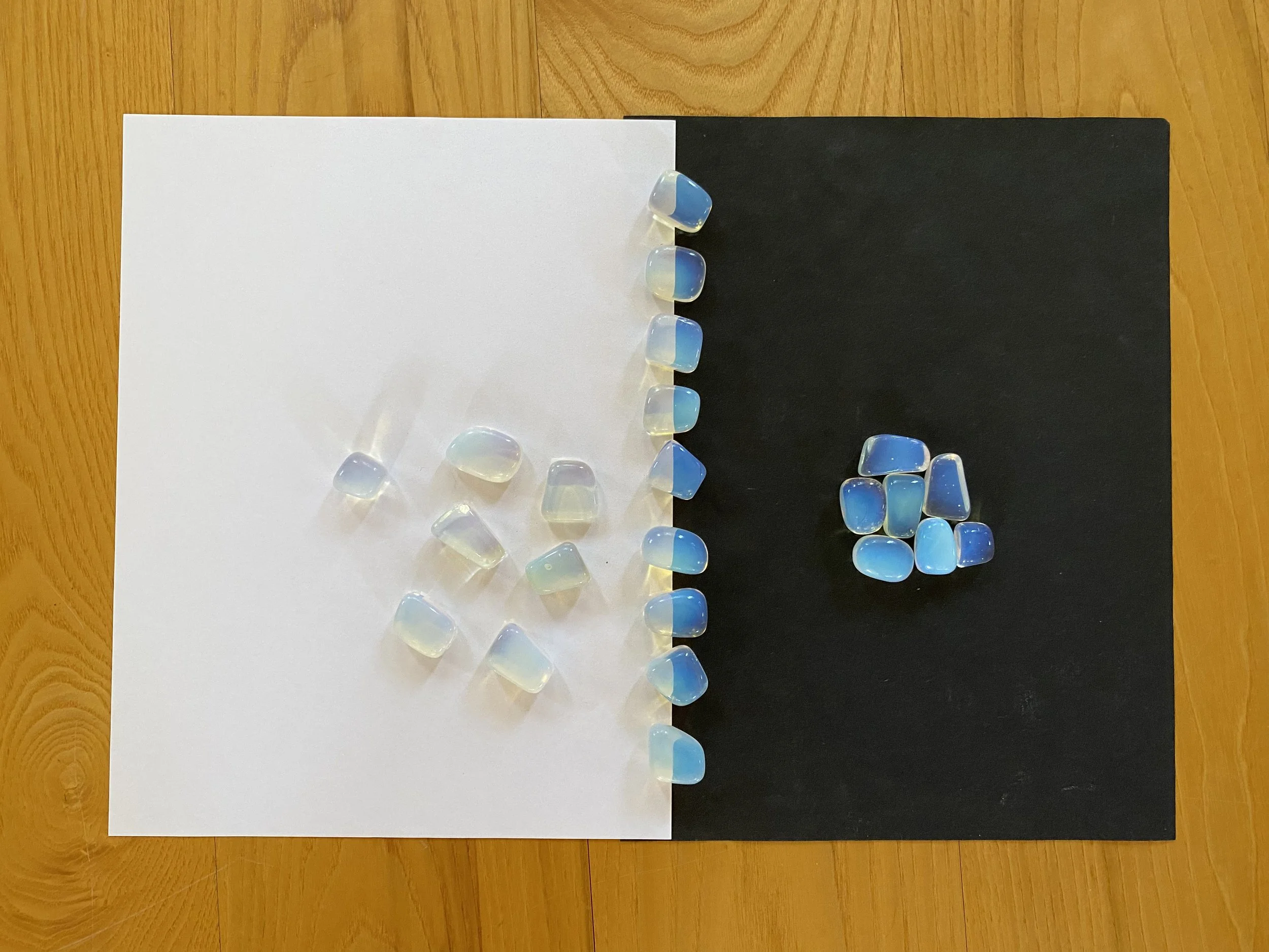
Color phenomena that arise through the interplay of light and turbid media rank high in Goethe’s color studies. We call a medium “turbid” when it is translucent — that is, not opaque — and yet not fully transparent. An example of such a medium is the milky glass of the opalites shown in the photo.
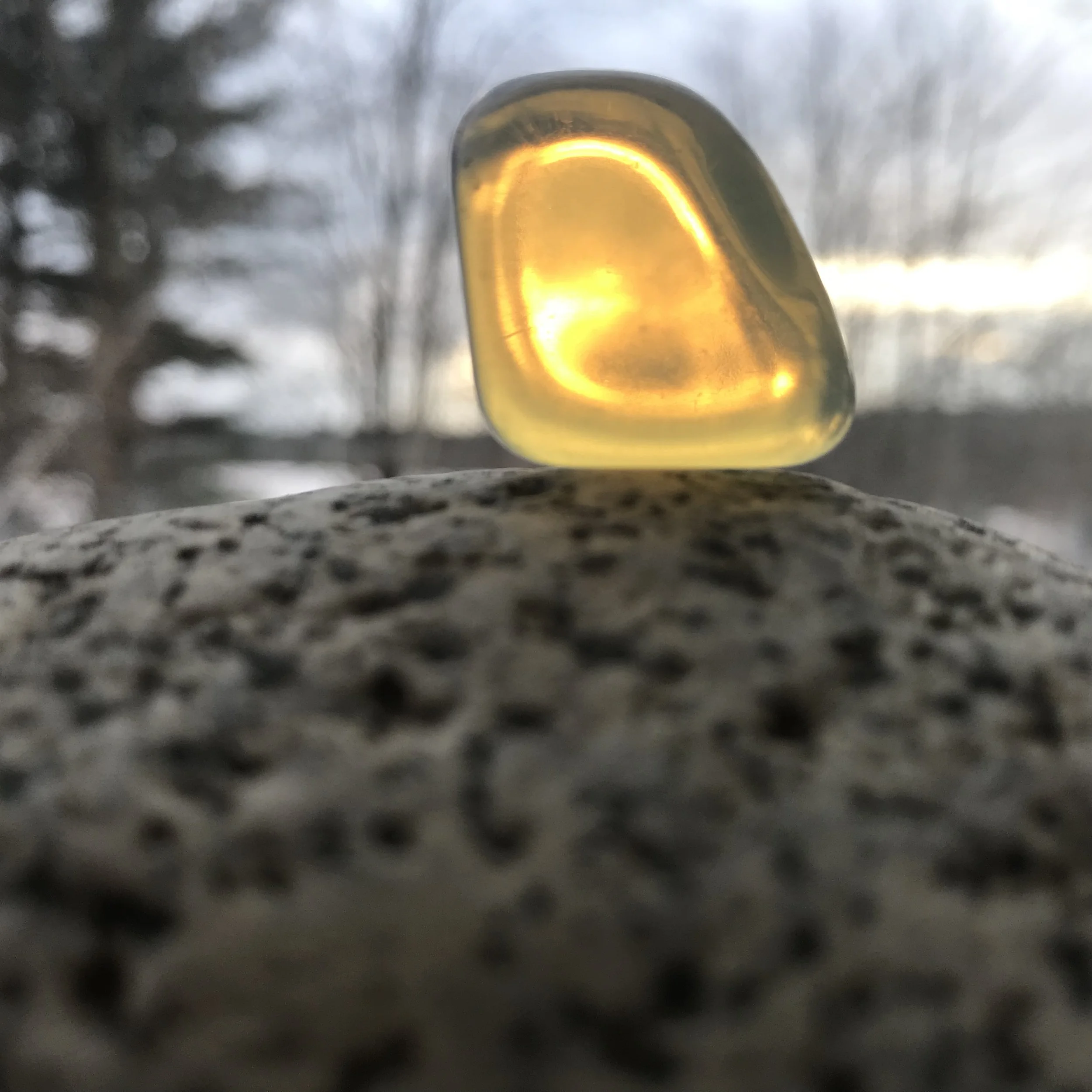
Warm colors arise when light shines through a turbid medium. The photo below shows an opalite that is placed on a stone and viewed against the bright overcast sky.
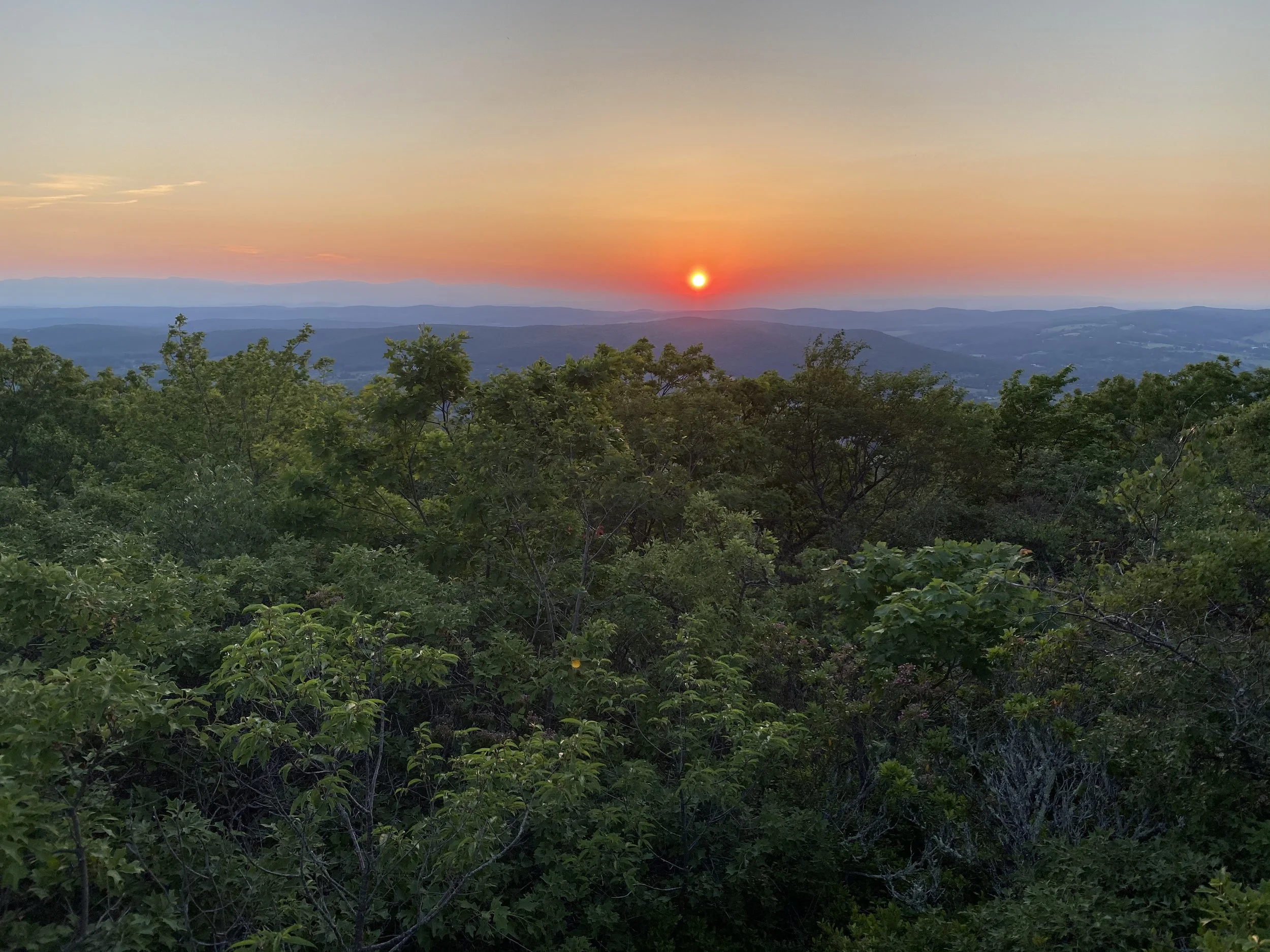
In nature, our atmosphere acts as a turbid medium as it carries, for instance, small water droplets, dust particles, smoke, or smog. Under varying atmospheric conditions, the rising or setting sun (and moon) can be yellow, orange, or red. Even high in the sky the otherwise blindingly bright sun can be red during a sand storm or through smoke of a wild fire.
When the turbidity increases, the light that shines through the turbid medium keeps diminishing in intensity and takes on hues from yellow, to orange, to red, to deep dark red, and to black (darkness) when, finally, the light source is fully obscured. During the summer intensive, sheets of white paper placed against the aperture of an old-fashioned slide projector demonstrated this for us. The visible aperture changed from blinding brightness through a range of warm colors when sheet after sheet of paper was added.
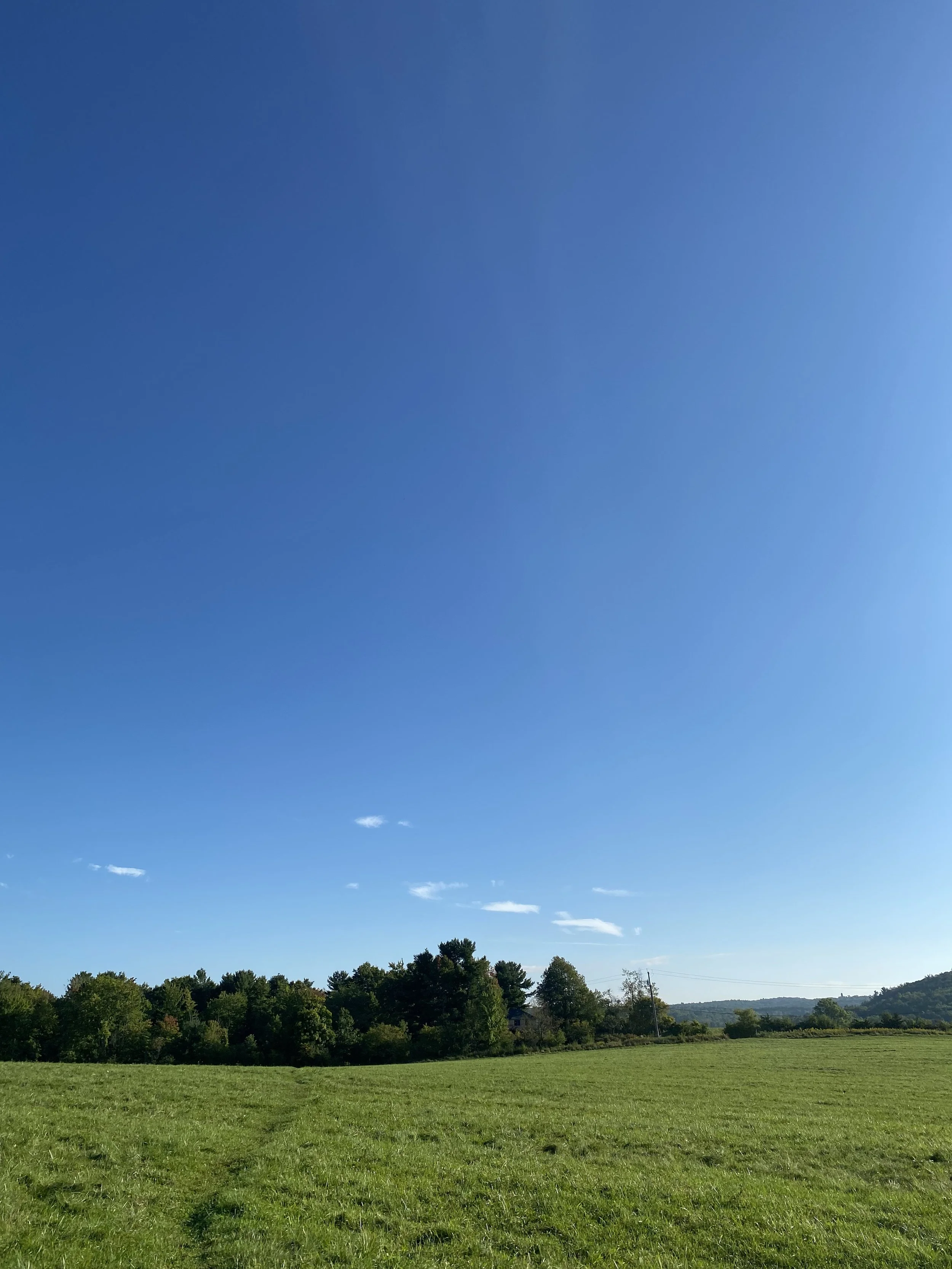
Cool colors, on the other hand, arise when light shines into a turbid medium in front of a dark background. That background can be dark like the night sky, a cave opening, a black surface, or it can be simply non-luminous like mountains or a forested hill side, or even a shaded snow field in the distance. With increasing turbidity of the medium, the black/dark/non-luminous background brightens to deep dark violet, to blue, to light blue, and eventually to white. The turbidity of our atmosphere, with the coming of the light at dawn, allows our skies to brighten from darkness to hues of blue. Dependent on weather conditions and the purity of the air, the hues of blue in our skies are different. When climbing up a mountain, the sky above us becomes darker blue. And the sky is always brighter blue or even white near the horizon.
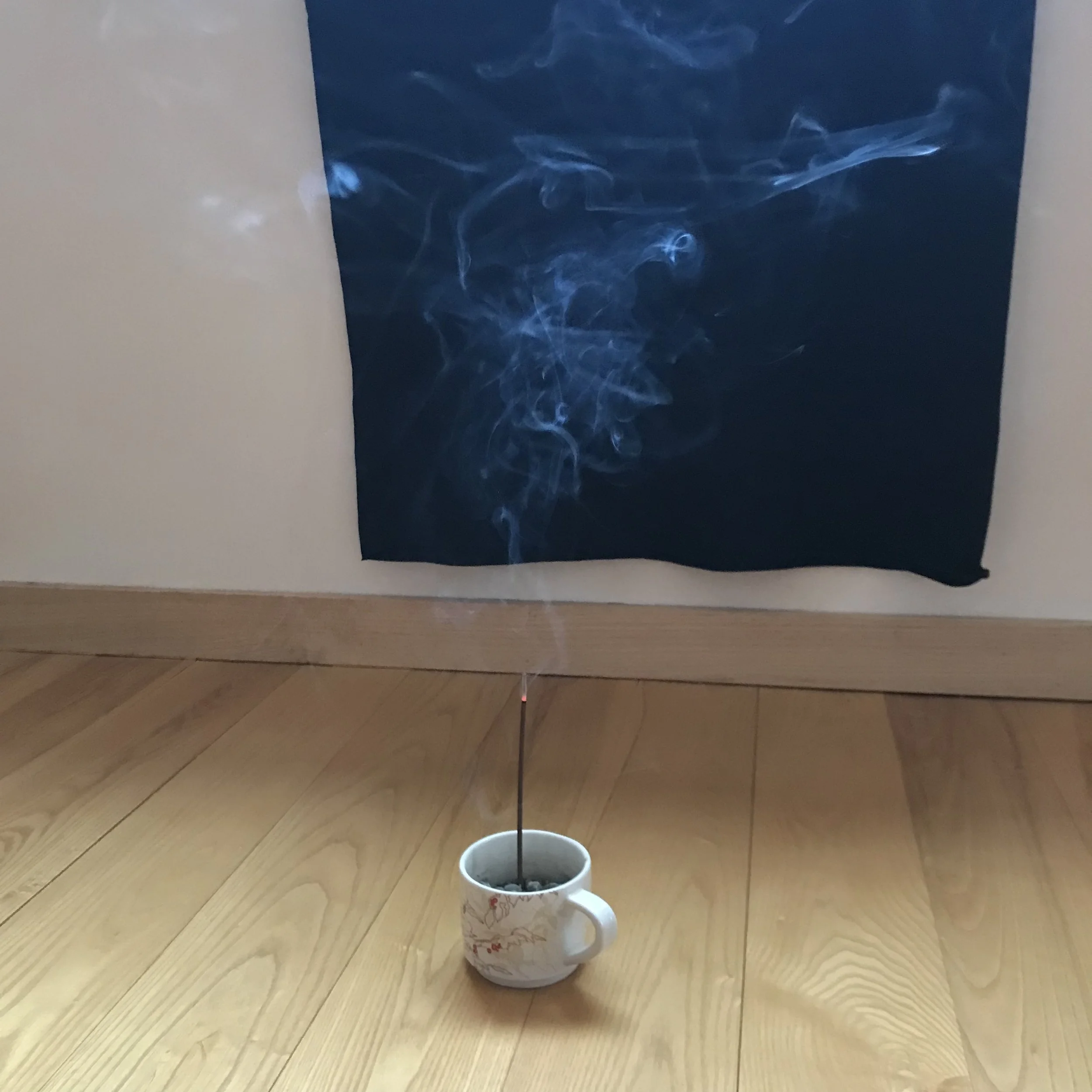
Indoors, during the summer course, we found these interactions of light, darkness, and turbid medium at work in the smoke of an incense stick. The smoke rose in front of a black cloth draped below a bright window. The smoke appeared blue when seen in front of the cloth, and denser smoke was lighter blue than less dense smoke.
The opalite that appears yellow in front of brightness appears blue in front of darkness.
In the grand scale of our atmosphere and landscapes, these color phenomena are at work in creating our colorful sunsets and sunrises, and the blueness of our skies and the blueness of our distant landscapes.
Warm colors are sometimes called “active colors.” The setting sun can cast a magical hue over our landscape and paint clouds pink. The cool colors, on the other hand, are sometimes called “passive colors.” The blue sky brightens our world but does not color it blue. Like the world, we are affected differently by cool than by warm colors. That may be a reason why we call them “warm” or ”cool.”
We can relate Goethe’s color wheel to these phenomena when we ignore the colors green and magenta. Then we have on one side red and yellow, on the other violet and cyan. We add the hues that arise with varying degrees of turbidity. From brightness (white) to darkness (black) the warm colors change when light shines through increasing turbidity. From darkness (black) to brightness (white) the cool colors change when light shines into increasing turbidity.
Colors that Arise Through Transparent Media
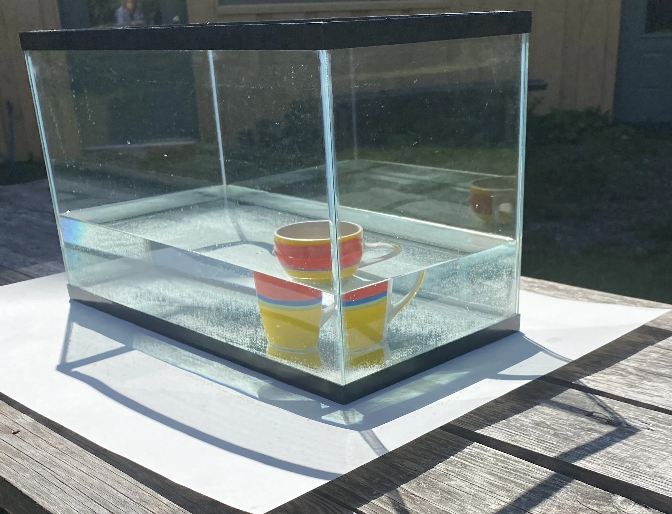
When you look at a cup placed in the water of an aquarium, you will see it through the horizontal surface of the water, or through one or two of the vertical sides of the aquarium, or through all three surfaces. Each surface gives you a different image of the cup. From above, the cup looks shortened in height, and the cup, as well as the whole bottom of the aquarium, appears lifted up. Looking through a side of the aquarium, the cup looks displaced, closer to that side, not shortened in height but flattened in depth. In the photo, the cup is only partially immersed in water. The cup as seen through the vertical sides of the aquarium appears disconnected from the part that sticks out of the water. The angle at which you view cup and aquarium greatly affects the images.
These phenomena are related to the refraction of light. If a beam of light shines into or even through a transparent medium like water or glass, it changes direction at the surface(s) of the transparent medium. In the terms of physics, the beam is refracted. In looking through a prism, or in shining light through a prism, we are dealing with refraction phenomena.
When you look at your surroundings through a prism and hold it so that its axis is horizontal, you will find that the seen image of a thing is either above or below the thing, depending on whether you look through the upward or the downward refracting angle of the prism. The visible thing seen through the prism and the touchable thing do not coincide. Accordingly, if you look through a prism in upright position, images of things appear to the right or to the left of the things.
Refraction phenomena are coupled with color phenomena. Looking through a prism, you will find that everywhere in your surroundings where contrasts appear, where something brighter borders something less bright, colors appear. At a simple boundary, they are either the cool colors violet and cyan, with violet bordering and spreading over the darker part and cyan bordering the brighter, or the warm colors yellow and red, with yellow next to and spreading over the brighter part and red bordering the darker. Colors appear along all lines of contrast, except for those in a particular orientation to the axis of the prism, as you see in the photo.
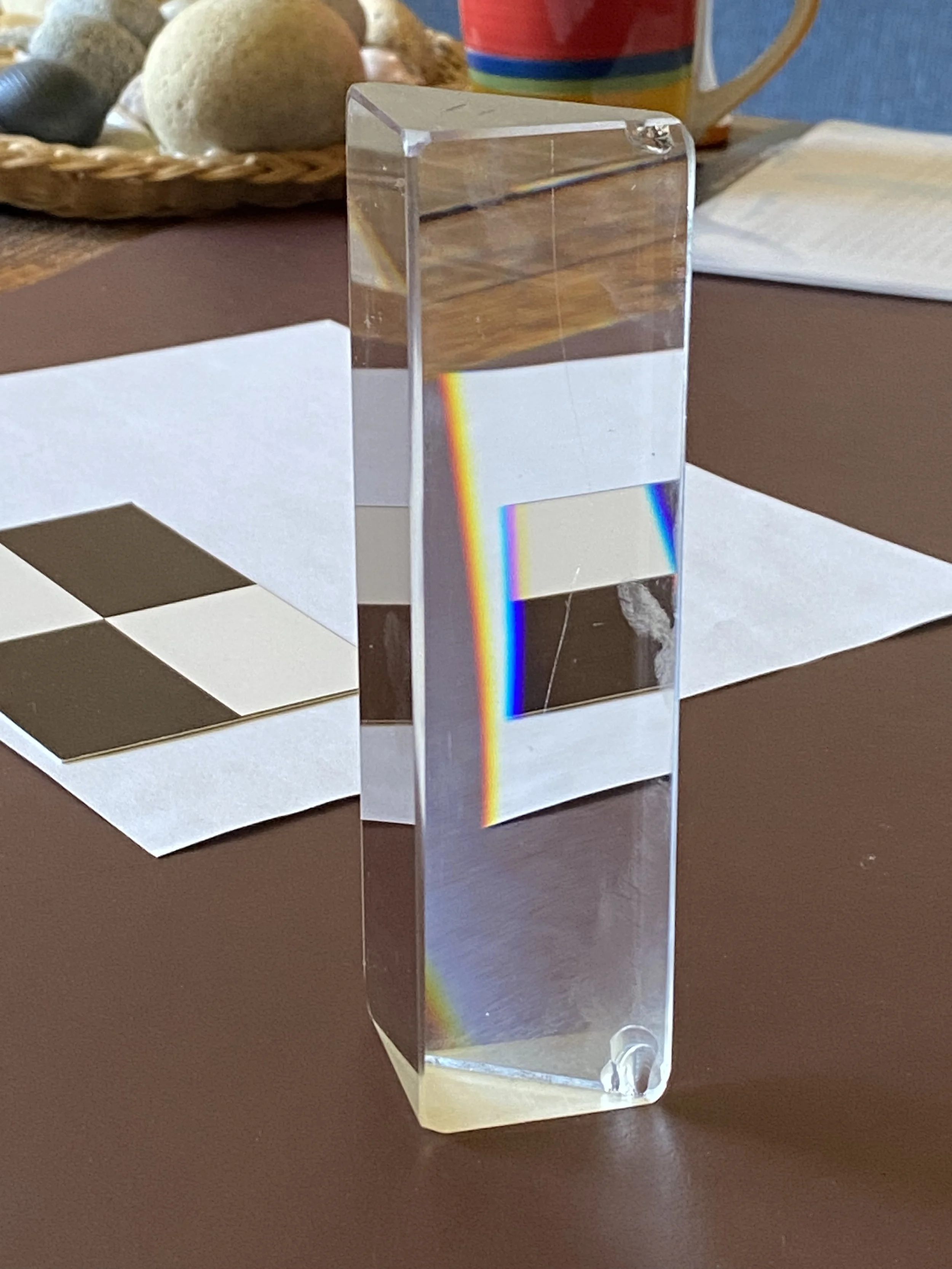
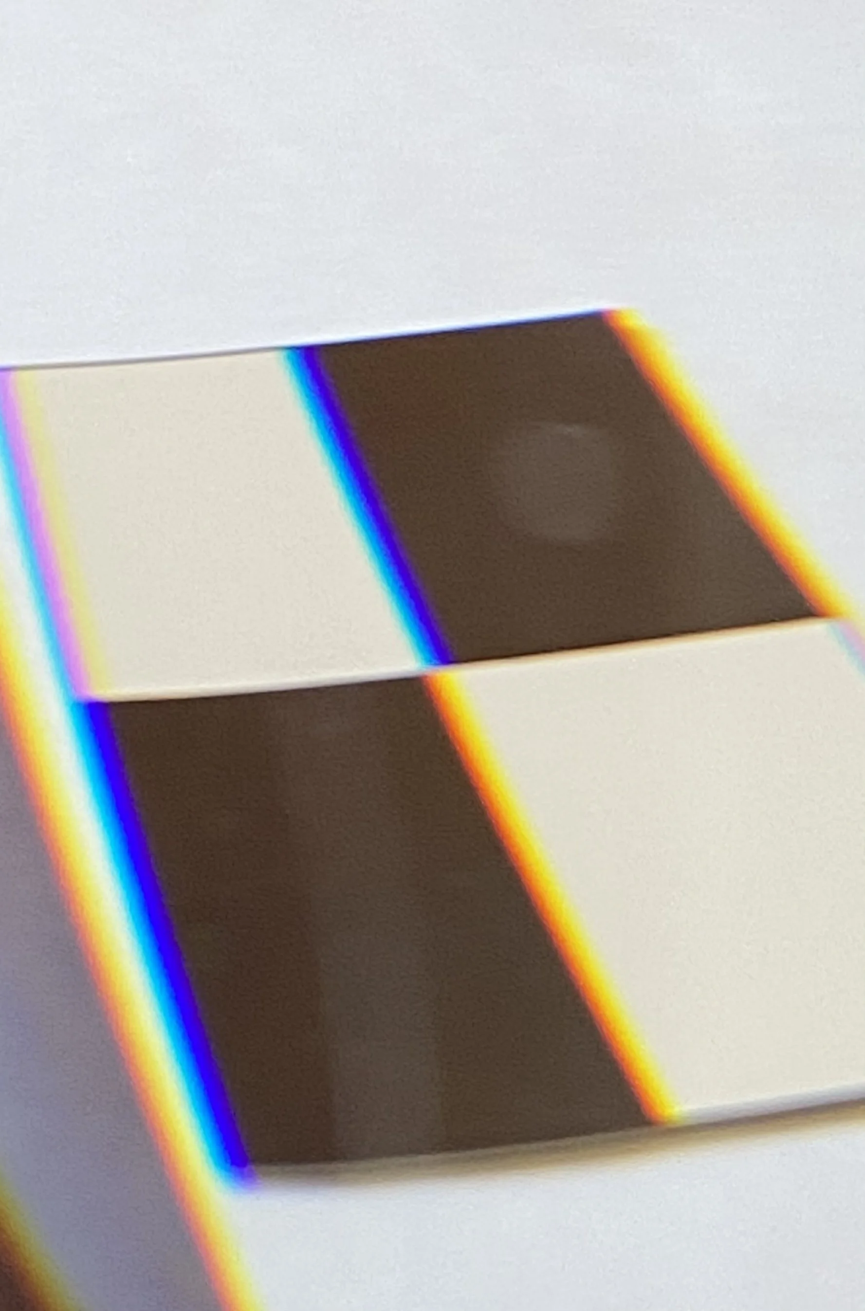
When you look through a prism at a sufficiently narrow strip of brightness between darkness on either side, you will find the color green between the cool and the warm colors. The two sets of colors have merged to create green between cyan and yellow. Violet on one side and red on the other are each bordering the darker parts.
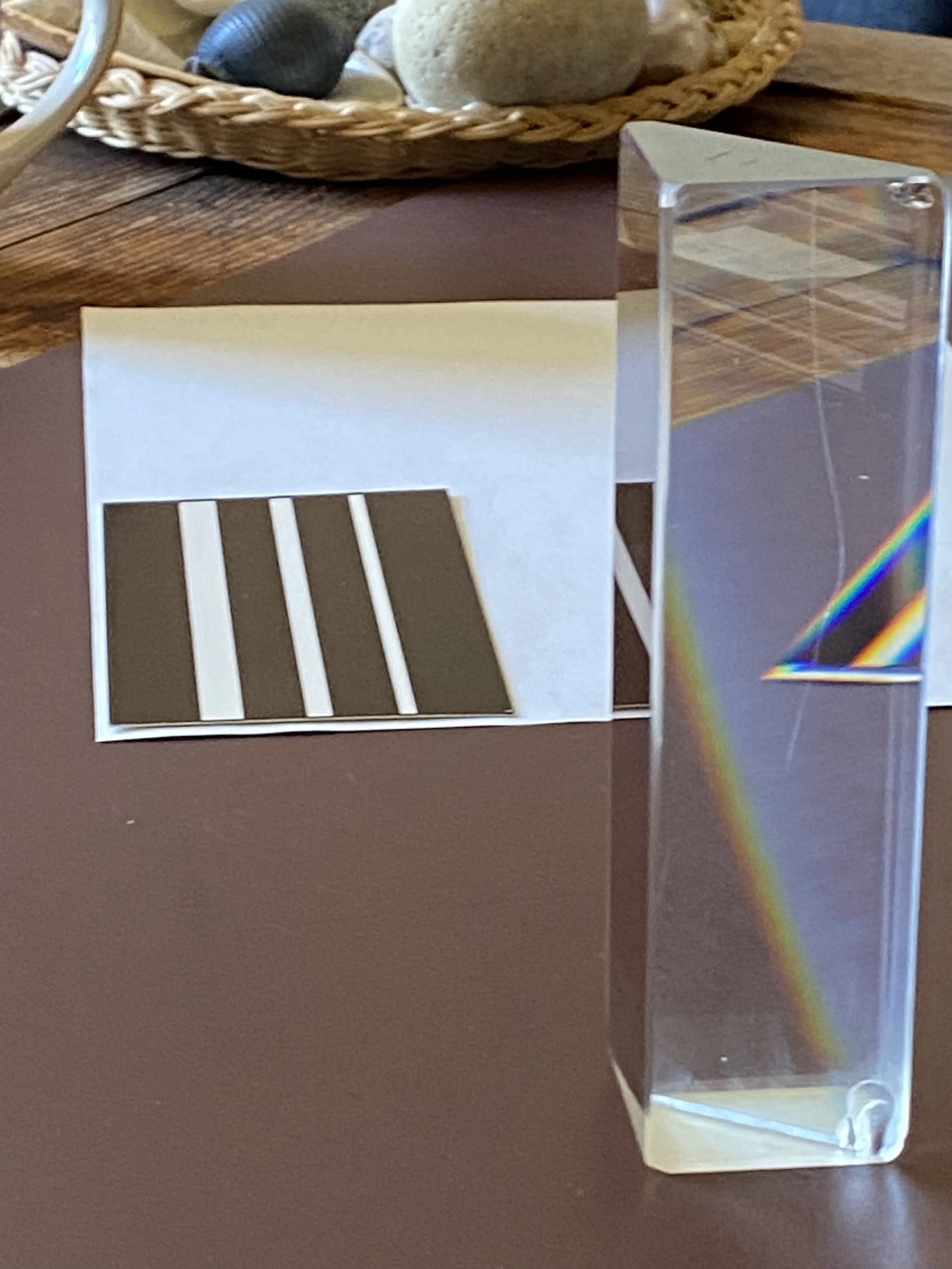
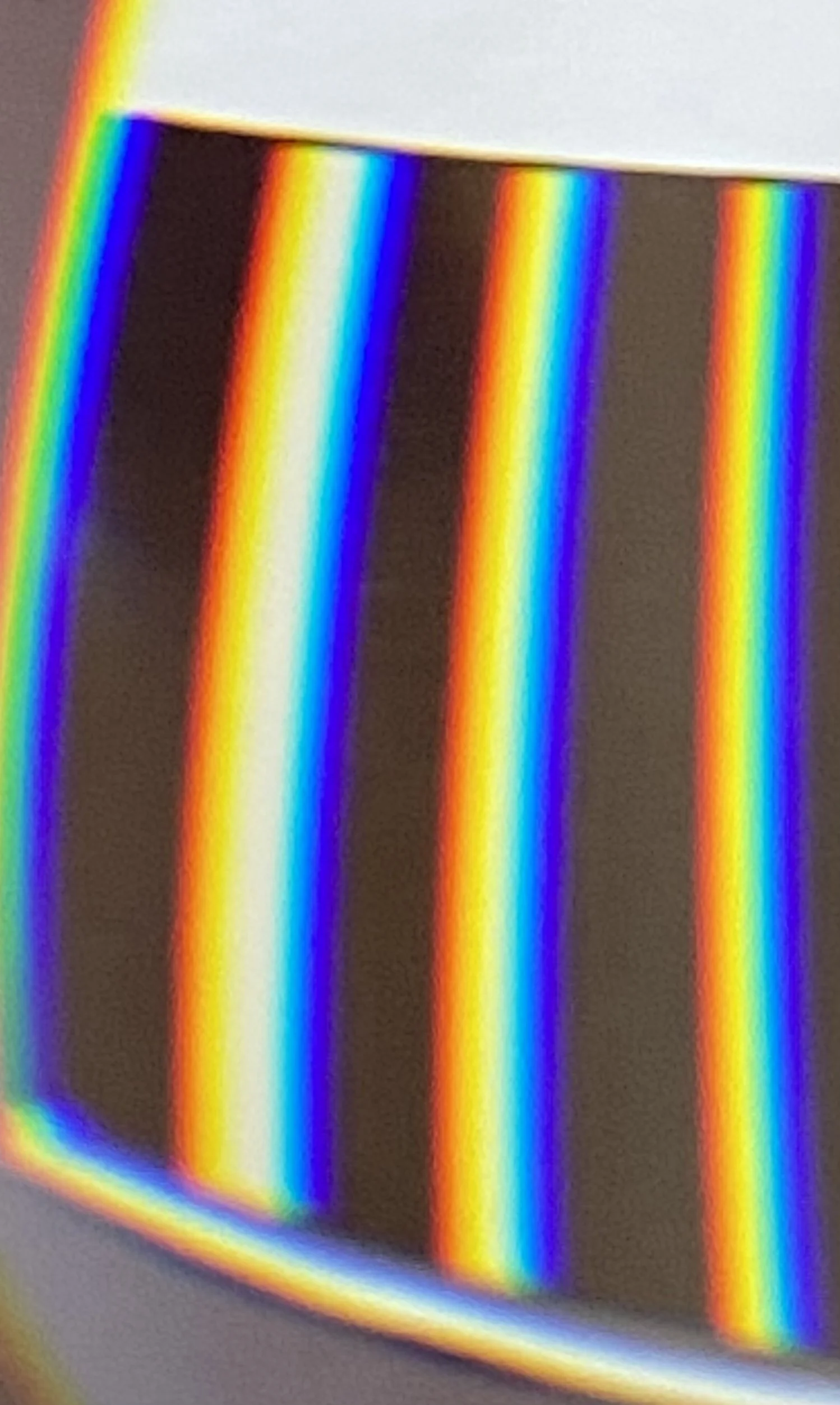
Again, look through a prism at your surroundings, this time at a strip of darkness bordered by brightness on both sides, like a narrow window bar. If the strip is sufficiently narrow, you will see the spectrum with magenta in the middle. The two sets of colors, the warm and the cool one, have merged to create magenta between red and violet.
As familiar as we are with the rainbow spectrum, many people have never seen the complementary spectrum. I remember my wonder and delight when I experienced it for the first time.
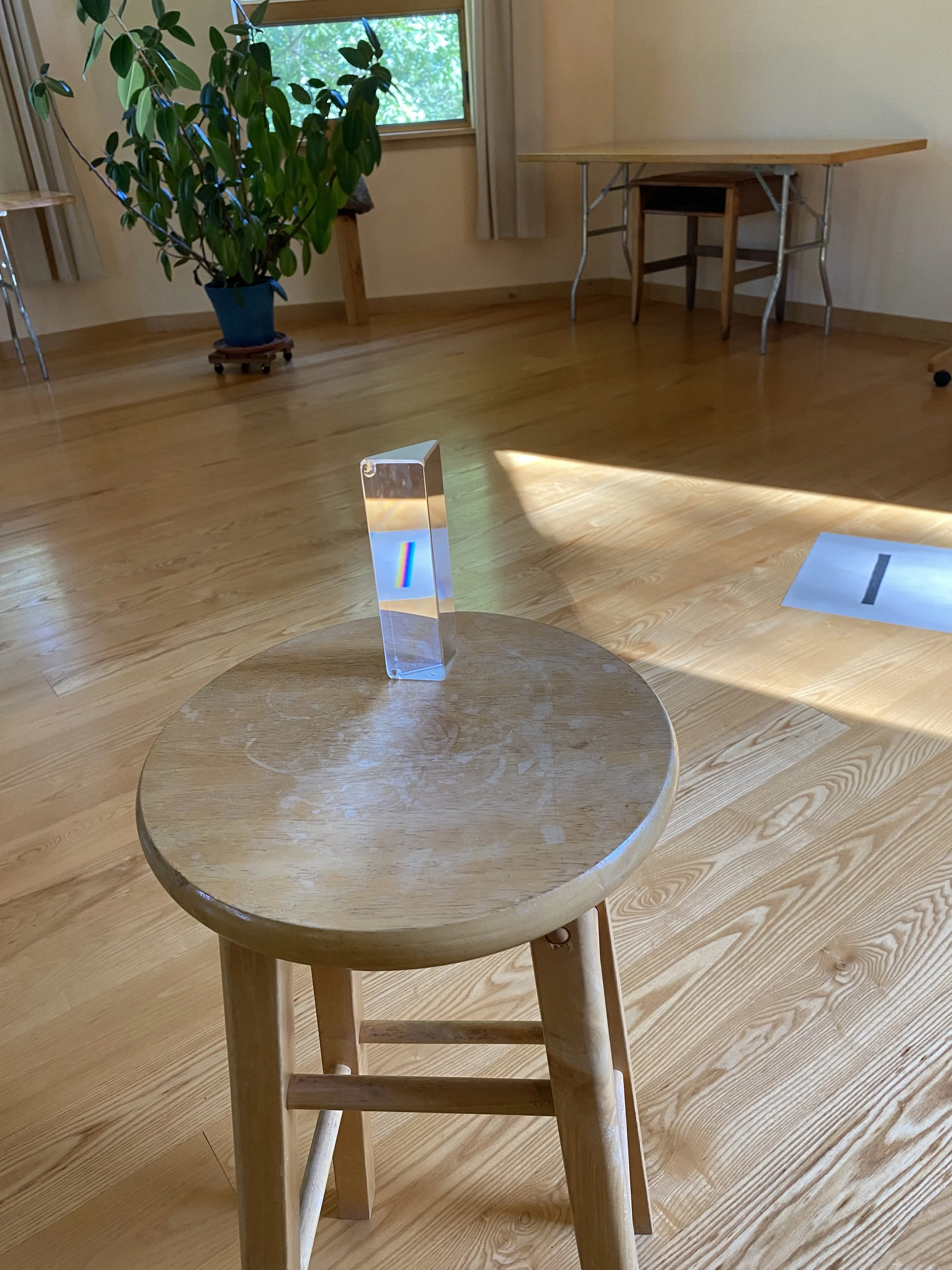
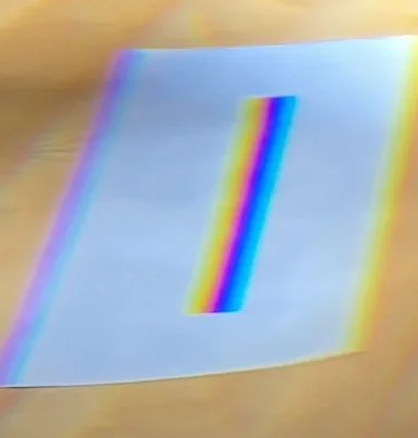
The color phenomena you find when looking through a prism at your surroundings are actually more complex than described so far. If your surroundings were only black, grey, and white, my descriptions above would be accurate. But normal surroundings are colorful. The prismatic colors described will mix with, or be superimposed on, the colors in your surroundings. You will find, therefore, the most interesting, perplexing, and differentiated hues when you take the time to observe and explore them.
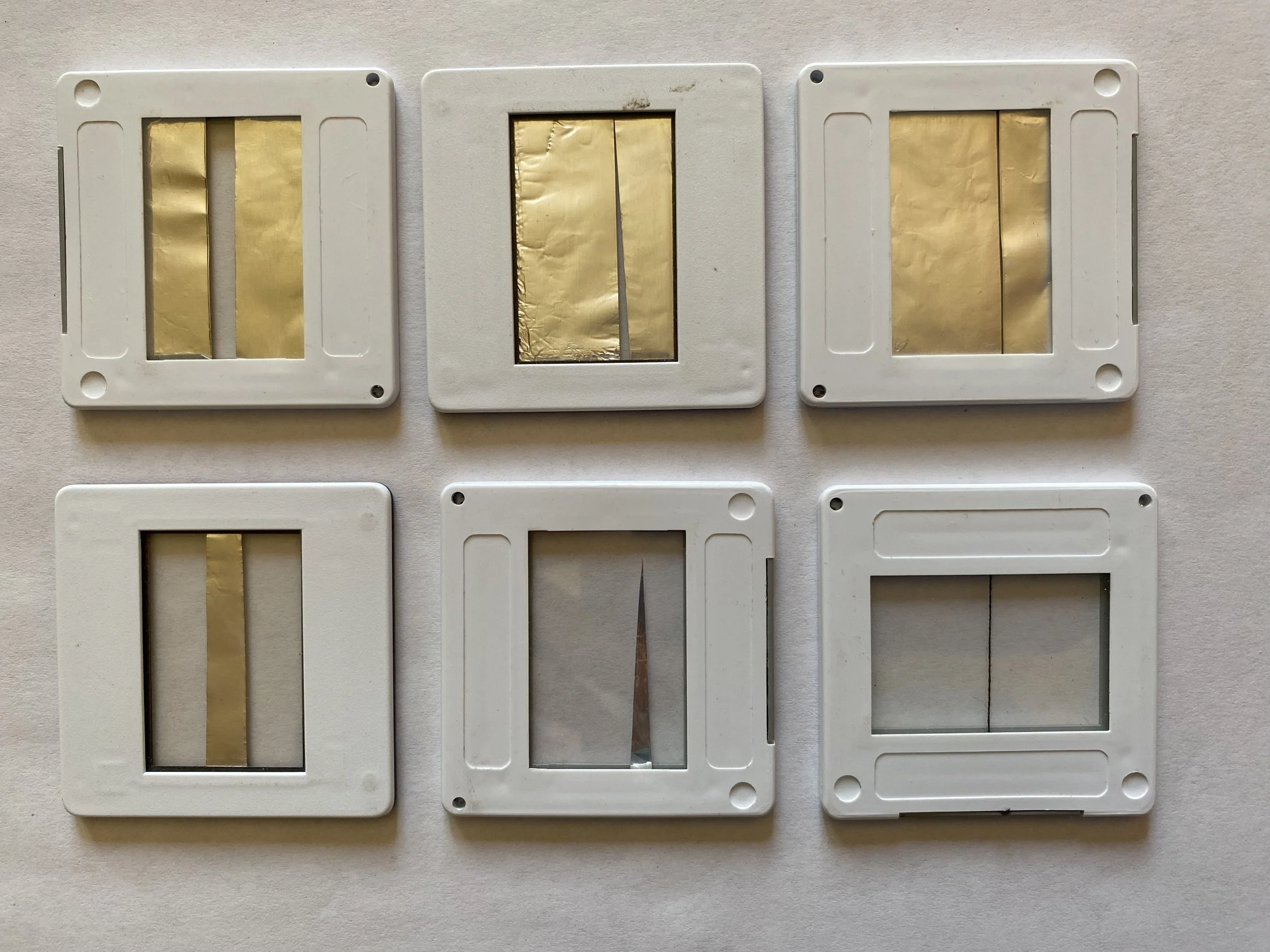
In a dark room, I can demonstrate the prismatic phenomena with the help of a slide projector, a prism, and suitable slides. The light of the slide projector, modified by a slide, shines through the prism that is placed upright at a certain distance from the aperture. The slides that bring forth the rainbow spectrum and those that create the complementary spectrum are exactly opposite each other. The slide that allows the projector light to shine through a narrow slit will create the rainbow spectrum at a sufficient distance from the prism. (The slit in my slide is a gap between two pieces of aluminum foil.) The slide that has only a narrow strip to block the light creates the complementary spectrum. (For that slide I used a piece of thin string.)
Isaac Newton focused on the rainbow spectrum in his research. Goethe was interested in the fact that the color magenta exists as a natural phenomenon and appears when the conditions that bring forth the rainbow spectrum are inverted. The sun in the sky is a blindingly bright disk in darker surroundings. It creates, together with raindrops, rainbows. A dark disk surrounded by brightness would bring forth the spectrum with magenta in the middle.
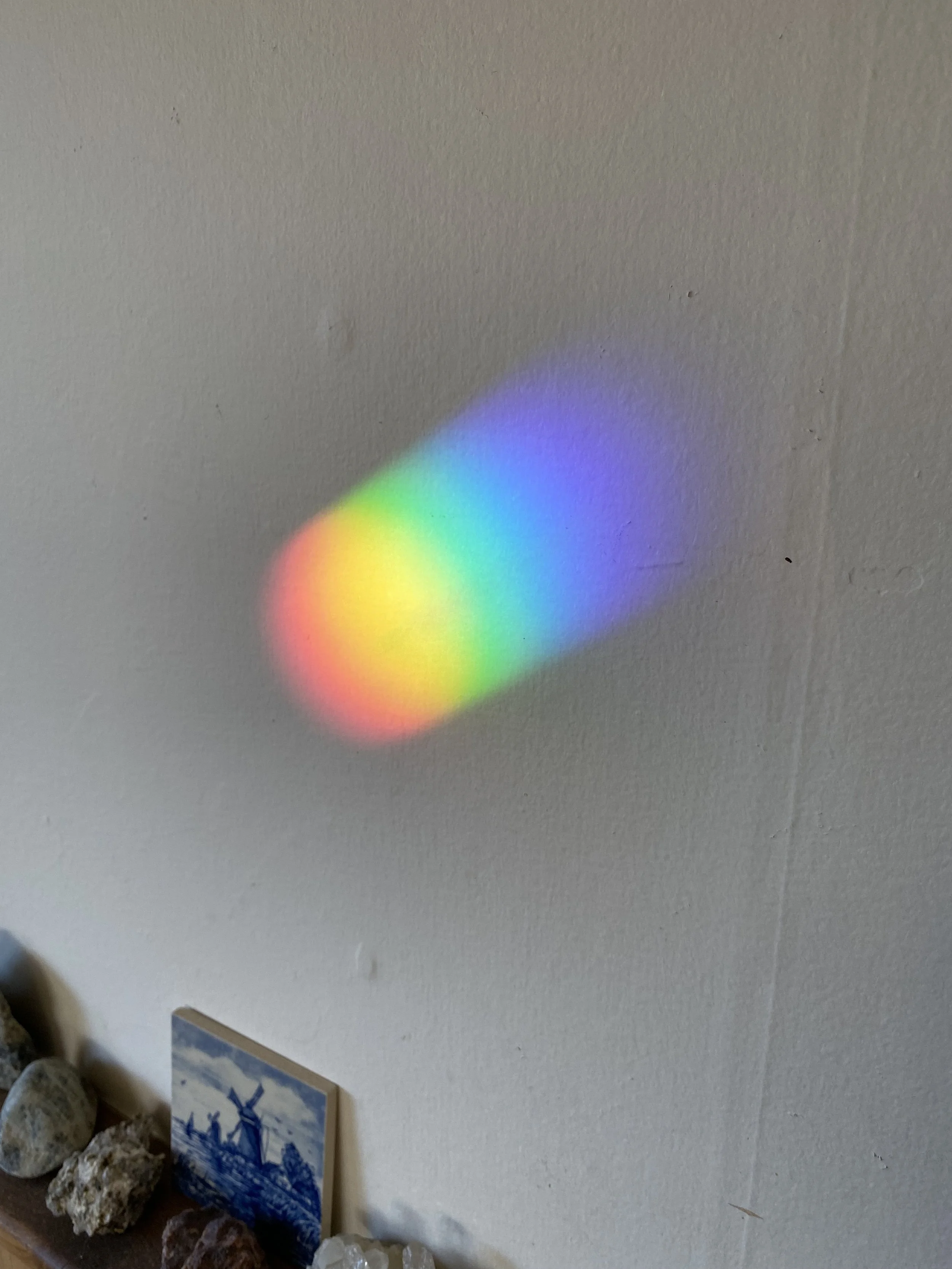
In the photo below, you see the colorful image of the morning sun on the wall of my living room. The wall is at some distance from, and opposite to, the window, where a small prism is suspended near the window pane.
When in Goethe's color wheel we take away the color magenta, we are left with the colors of the rainbow spectrum: red, yellow, green, cyan, violet. Adding the colors orange (between red and yellow) and blue (between cyan and violet), we have the seven colors of which Newton speaks. When we take away the color green from the wheel and leave magenta in place, we are left with the colors of the complementary spectrum: cyan, blue, violet, magenta, red, orange, yellow.
Goethe's color wheel expresses a wholeness of colors and their relations. The wholeness will become even more striking through the phenomena of color mixing, simultaneous contrast and colored shadows, and colored illumination of the colorful world. Those will be the focus of an article in the next issue of In Context